- UploadButton: добавлена опция лоадера - Selects: фикс браузерных тултипов
A collection of unstyled, accessible UI components for React, utilizing state machines for seamless interaction.
A collection of unstyled, accessible UI components for Solid, utilizing state machines for seamless interaction.
A collection of unstyled, accessible UI components for Vue, utilizing state machines for seamless interaction.
An opinionated UI component library for Svelte, built on top of [Ark UI](https://ark-ui.com) with additional components and features not available in the core Ark UI library.
Underlying schema language parsed from arktype syntax.
A collection of unstyled, accessible UI components for Vue, utilizing state machines for seamless interaction.
Sidecar code splitting utils
TailwindCSS plugin for zag-powered components
The official MCP server for Ark UI
TypeScript's 1:1 validator, optimized from editor to runtime
Unstyled Light-DOM-Only Web Components
A middleware for using SwaggerUI in Hono
React Common package delivers common utilities that can be used with the KendoReact UI components. KendoReact Common Utilities package
Theme and components agnostic ChakraProvider
Storybook: Develop, document, and test UI components in isolation
Cross-Platform Utilities for ARK Applications
[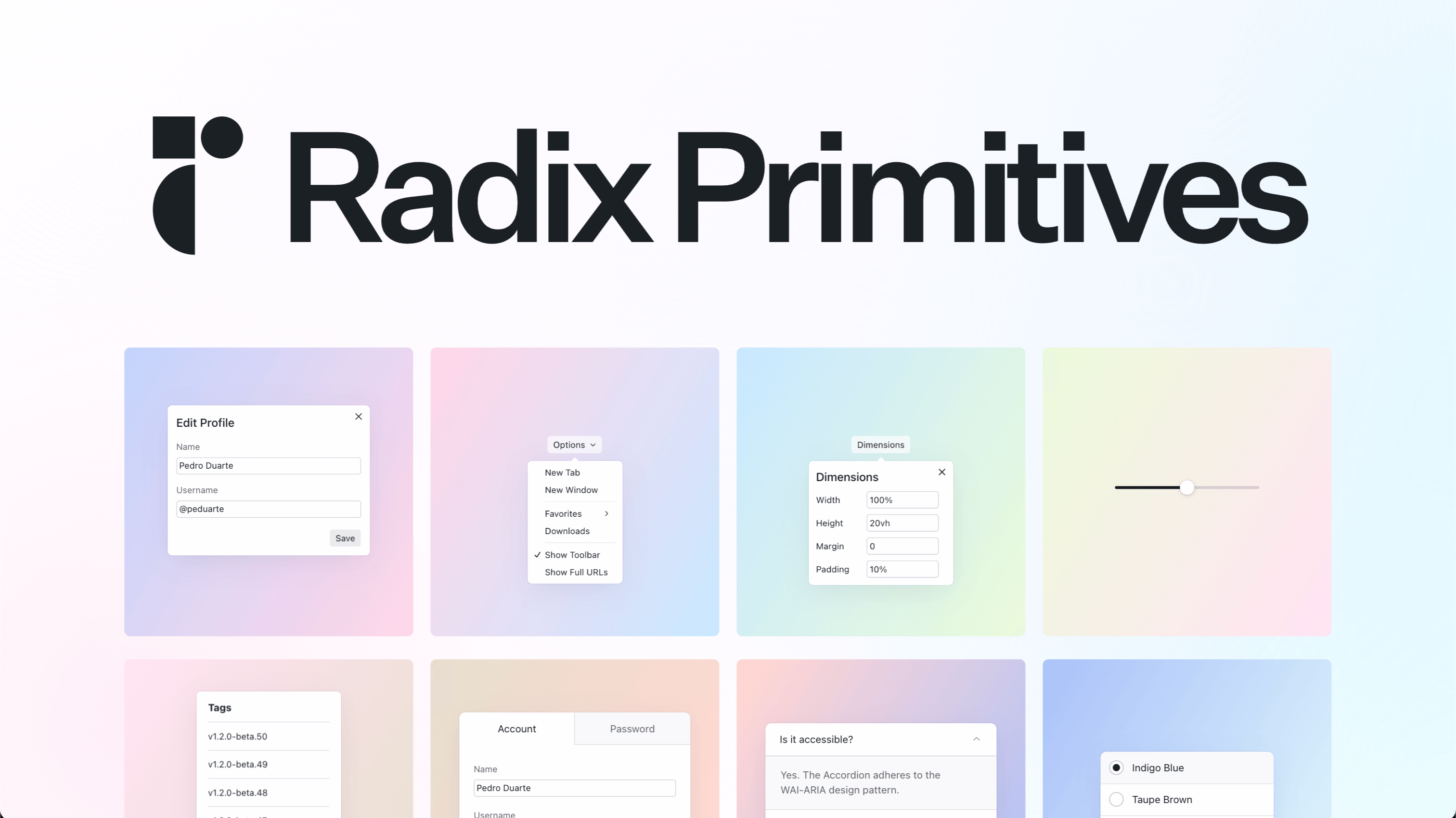](https://radix-ui.com/primitives)
React Inputs offer a customizable interface for users to enter and pick different information. KendoReact Input package
React component to render a placeholders while you wait for content to load
React Popup positions a piece of content next to a specific anchor component. KendoReact Popup package
Kendo UI Angular Popup component - an easily customized popup from the most trusted provider of professional Angular components.
React Labels package provides components for labelling form editors. KendoReact Labels package
Kendo UI for Angular Excel Export component