Bộ component UI cho React, phân phối qua CLI — copy trực tiếp vào dự án của bạn, không cần cài như package dependency (tương tự shadcn/ui).
A collection of React utility functions for Base UI.
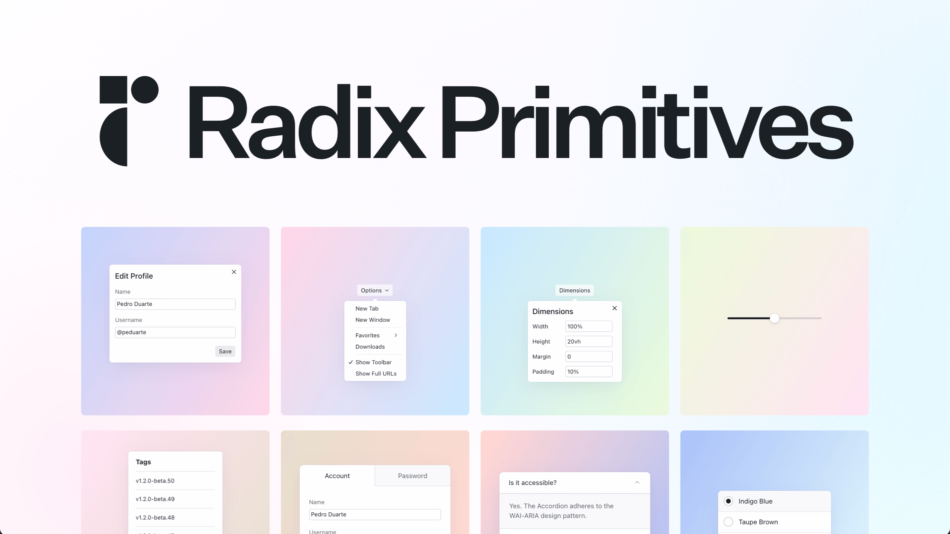
Base UI is a library of headless ('unstyled') React components and low-level hooks. You gain complete control over your app's CSS and accessibility features.
<!-- @TODO -->
Material UI is an open-source React component library that implements Google's Material Design. It's comprehensive and can be used in production out of the box.
Generates random ids with a prefix (a la Stripe)
Gatsby plugin for adding Theme UI context
A base React component for icons
Theming Base Content
Resolve a URI relative to an optional base URI
[](https://radix-ui.com/primitives)
LeafyGreen UI Palettes
Basic layout model and some utilities for Cytoscape.js layout extensions
Core module for compound spring embedder based layout styles
Joy UI is an open-source React component library that implements MUI's own design principles. It's comprehensive and can be used in production out of the box.
少数派UI
This is a base dependency for Umbraco UI components. It contains mixins, animations, abstract base classes, UUIEvent base class, and universal types for properties shared by different components
Theme UI includes `@theme-ui/preset-base` which can be used as an example or starting point for extending your own themes.
The Chakra UI Pro Theme extends the base Chakra UI theme by introducing additional component variants, sizes, and a collection of semantic tokens and text layer styles. Made to fit perfectly with the original Chakra UI theme, the Pro Theme makes your user
Framework for rapidly creating high quality, server-side node.js applications, using plugins like building blocks
abstract base class for crypto-streams
Turn a function into an `http.Agent` instance
Modal state management library for Base UI based components
abstract base class for hash-streams