An Easy to Use UI Component Library for Faster Frontend Development
A simply-to-use UI component that generates an animated background of ascii characters
Sidecar code splitting utils
rxz-ui is a combined API based on Vue3, providing rich components, instructions, Use UI component library.
A middleware for using SwaggerUI in Hono
React Common package delivers common utilities that can be used with the KendoReact UI components. KendoReact Common Utilities package
Theme and components agnostic ChakraProvider
Storybook: Develop, document, and test UI components in isolation
SVAR React Core library is a collection of customizable React UI components and form controls
A Quick description of the component
React Labels package provides components for labelling form editors. KendoReact Labels package
React Inputs offer a customizable interface for users to enter and pick different information. KendoReact Input package
[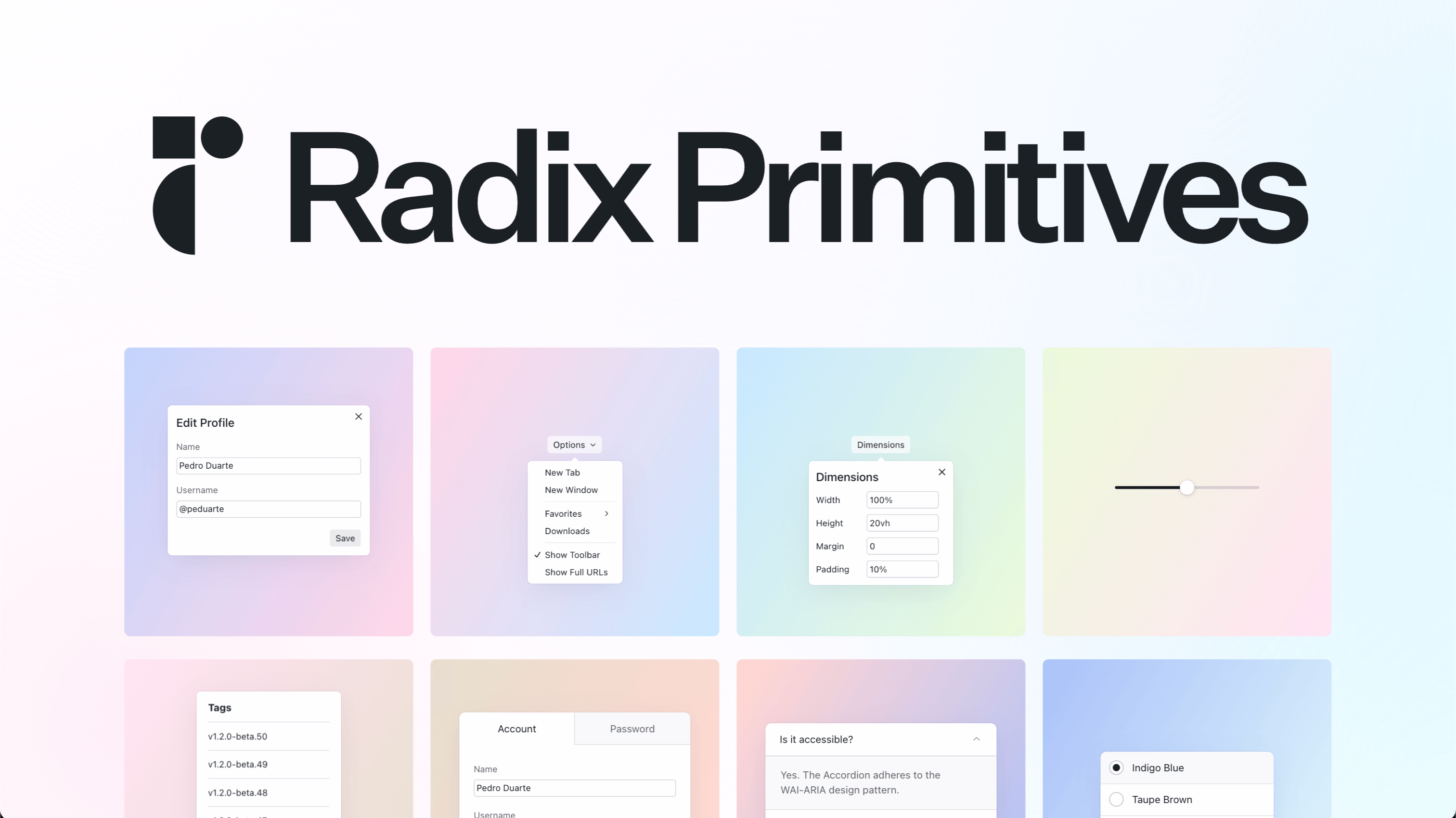](https://radix-ui.com/primitives)
React Popup positions a piece of content next to a specific anchor component. KendoReact Popup package
A Quick description of the component
AstraUI is a comprehensive, easy-to-use UI component library for React applications, built with TypeScript for robustness and type safety. Our library provides a stellar collection of reusable components designed to equip developers with the tools they ne
A Quick description of the component
React hook to track previous value
A Quick description of the component
A Quick description of the component
React hook to track previous value
React hook for setTimeout
All you need in React Button in one package: disabled/enabled states, built-in styles and more. KendoReact Buttons package
Material UI is an open-source React component library that implements Google's Material Design. It's comprehensive and can be used in production out of the box.
PhlexyUI is a Ruby UI component library for DaisyUI using Phlex
Build reusable UI components for Rails applications with the ability to use the BEM methodology.
A Rails port of shadcn/ui - a collection of beautifully designed, accessible components built with ViewComponents, Stimulus, and Tailwind CSS. Includes theming support, dark mode, and full component parity with the original library.
UI components for Rails using Turbo.
A UI component that generates an unordered list of filters that use named scopes within an ActiveRecord model to filter a list. It is not tied to a table or list specifically as it simply manipulates the url, resulting in a manipulation of any collection (list, table, etc.) it may be coupled with.
This gem allows you to use the luca-ui backbone.js component framework easily with the assets pipeline
Archetype is a Compass/Sass based framework for authoring configurable, composable UI components and patterns. The natural language syntax that Archetype provides allows designers and developer to discuss UI compositions using the same vocabulary.
innoQ UI components for use in internal applications
TkComponent allows you to create desktop UIs using a component structure taking advantadge of TK, the UI toolkit created for TCL and used by Python in TkInter
An opinionated UI component regression testing tool built to be tightly integrated with RSpec, Selenium and tools you already use.
This gem provides ui components for Rails Applicaitons based on Cells, that can be used to edit the criteria_operator expression trees.
M9sh is a component library for Rails applications using ViewComponent and Hotwire, inspired by shadcn/ui. Generate beautiful, accessible UI components with a powerful CLI.
No description provided.
No description provided.
No description provided.
No description provided.
No description provided.
No description provided.
No description provided.
No description provided.
No description provided.
No description provided.
No description provided.
No description provided.